Spacing
Spacing is a key tool for positioning elements in relation to each other, highlighting some while downplaying others. Consistent spacing boosts visual appeal and guides users through content. It connects size and visual consistency through aligning baselines, gutters, padding, and margins.
While Salt provides a general approach to spacing, it isn’t an exhaustive set of guidelines.
Consistent use of spatial tokens helps align layouts, establish a clear visual rhythm, and enhance your application's overall design.
Salt’s spacing system uses a base unit, --salt-spacing-100, which scales proportionally across all desktop densities (high, medium and low densities). Each spacing token is a multiple or percentage of this base unit, ensuring predictable and flexible spacing.
Mobile density uses a different spacing formula, tailored to optimize usability and readability on phones or tablets.
Learn more about desktop densities, mobile densities, and how to choose densities in the Density foundation.
| Token | High Density (px) | Medium Density (px) | Low Density (px) | Touch Density (px) | Mobile Density (px) |
|---|---|---|---|---|---|
--salt-spacing-25 | 1 | 2 | 3 | 4 | 4 |
--salt-spacing-50 | 2 | 4 | 6 | 8 | 8 |
--salt-spacing-75 | 3 | 6 | 9 | 12 | 12 |
--salt-spacing-100 | 4 | 8 | 12 | 16 | 16 |
--salt-spacing-150 | 6 | 12 | 18 | 24 | 18 |
--salt-spacing-200 | 8 | 16 | 24 | 32 | 20 |
--salt-spacing-250 | 10 | 20 | 30 | 40 | 22 |
--salt-spacing-300 | 12 | 24 | 36 | 48 | 24 |
--salt-spacing-350 | 14 | 28 | 42 | 56 | 26 |
--salt-spacing-400 | 16 | 32 | 48 | 64 | 28 |
--salt-spacing-450 | 18 | 36 | 54 | 72 | 30 |
--salt-spacing-500 | 20 | 40 | 60 | 80 | 32 |
--salt-spacing-550 | 22 | 44 | 66 | 88 | 34 |
--salt-spacing-600 | 24 | 48 | 72 | 96 | 36 |
--salt-spacing-650 | 26 | 52 | 78 | 104 | 38 |
--salt-spacing-700 | 28 | 56 | 84 | 112 | 40 |
--salt-spacing-750 | 30 | 60 | 90 | 120 | 42 |
--salt-spacing-800 | 32 | 64 | 96 | 128 | 44 |
--salt-spacing-850 | 34 | 68 | 102 | 136 | 46 |
--salt-spacing-900 | 36 | 72 | 108 | 144 | 48 |
--salt-spacing-950 | 38 | 76 | 114 | 152 | 50 |
Fixed spacing provides tokens with values that remain constant across all densities. For example, --salt-spacing-fixed-100 always equals 1px, and --salt-spacing-fixed-200 always equals 2px, regardless of the selected density. These tokens offer a reliable reference for design elements that require uniform spacing, helping to ensure consistency and simplicity throughout the design system.
| Token | All densities (px) |
|---|---|
--salt-spacing-fixed-100 | 1 |
--salt-spacing-fixed-200 | 2 |
--salt-spacing-fixed-300 | 3 |
--salt-spacing-fixed-400 | 4 |
--salt-spacing-fixed-500 | 5 |
--salt-spacing-fixed-600 | 6 |
--salt-spacing-fixed-700 | 7 |
--salt-spacing-fixed-800 | 8 |
--salt-spacing-fixed-900 | 9 |
--salt-spacing-fixed-1000 | 10 |
--salt-spacing-fixed-1100 | 11 |
--salt-spacing-fixed-1200 | 12 |
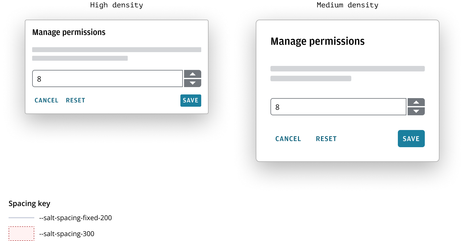
For example, imagine a numerical input with two adjacent buttons that let users step through values incrementally. Fixed spacing tokens are used to set the distance between the input and the buttons, as well as the space between the two buttons. These fixed spaces remain constant, ensuring precise alignment and uniformity regardless of density settings. In contrast, the spacing between the numerical input and other components adapts according to the selected density, offering flexibility and responsiveness throughout the interface.
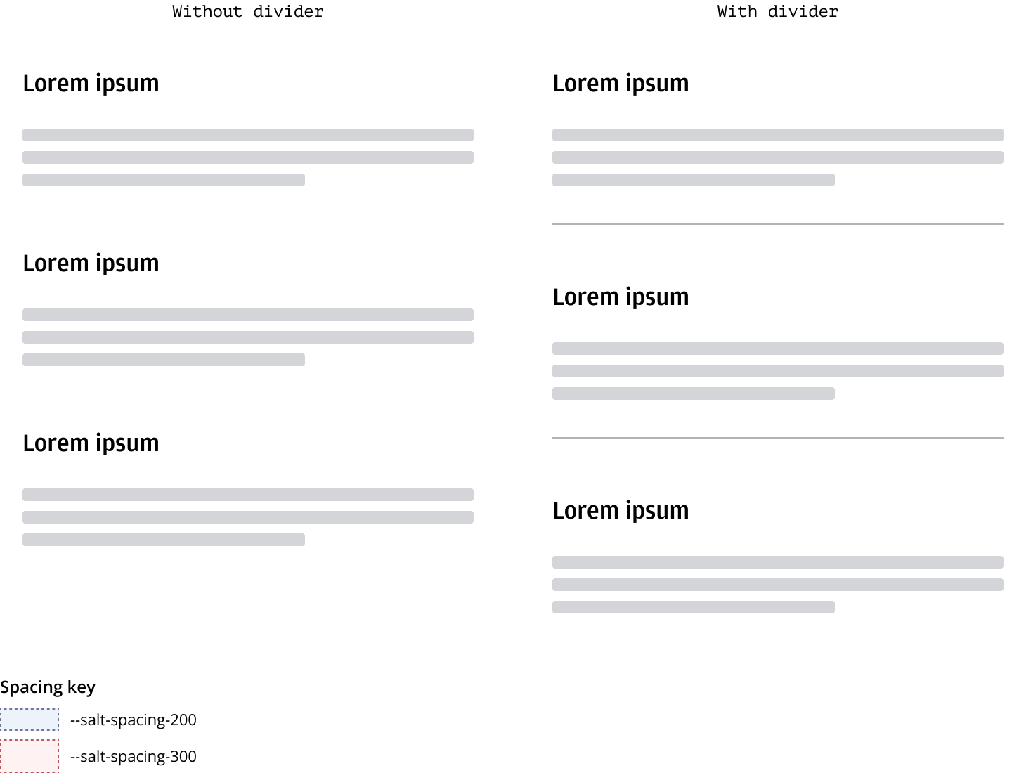
Spacing is a key tool for emphasizing certain elements while downplaying others, guiding users through content. We suggest using varied spacing (--salt-spacing-300, --salt-spacing-200, --salt-spacing-100) to establish a visual hierarchy. Consistent vertical separation of items like headings, text blocks, form elements, and cards creates a visual rhythm.
Horizontal dividers help segment layout regions and should be consistently spaced on the page. For more details on dividers, please refer to Divider.
Headings act as primary titles for various content types, offering visual separation and hierarchy. They should have standard spacing both above and below. The spacing directly below a heading varies based on the level of focus on the item.
For more information on using spacing in headers, please refer to the Forms pattern.
| Heading | Space above | Space below |
|---|---|---|
| H1 | --salt-spacing-200 | --salt-spacing-300 |
| H2 | --salt-spacing-200 | --salt-spacing-200 |
| H3 | --salt-spacing-200 | --salt-spacing-100 |
| H4 | --salt-spacing-200 | None |
A container represents an enclosed area with information, this is typically anything that is in a div in code. Padding is the space inside a given area, controlling the distance between its content and boundary. Padding in containers varies depending on the container size.
Please refer to the header block pattern to learn more about container padding in context.
| Container size | Padding size |
|---|---|
| Large | --salt-spacing-300 |
| Medium | --salt-spacing-200 |
| Small | --salt-spacing-100 |
Horizontal spacing between items can vary depending on relationship and context.
| Horizontal spacing | Space between |
|---|---|
| Between buttons | --salt-spacing-100 |
| Between components | --salt-spacing-300 or --salt-layout-gap |
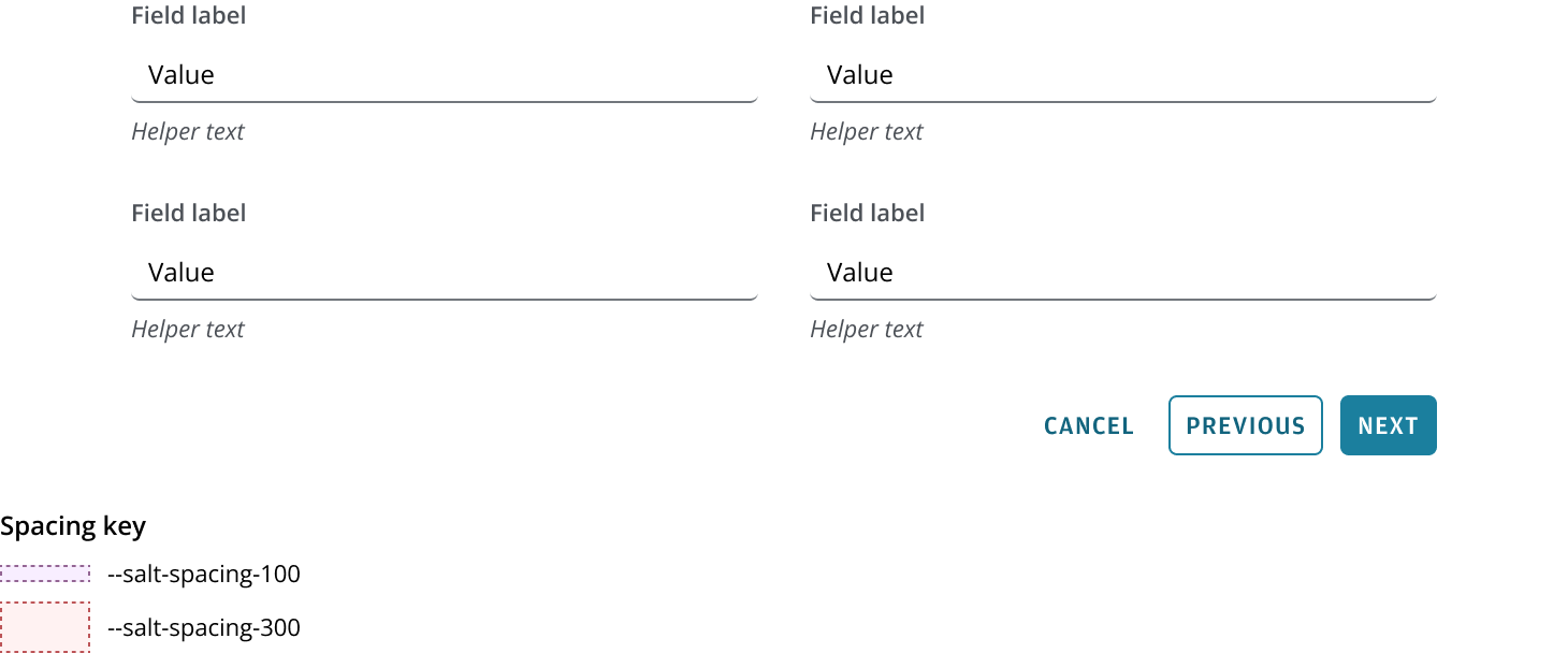
Standard spacing between items in a form pattern is typically --salt-spacing-300, which aligns with the design systems responsive layout grid, and automatically will adjust depending on what density you use.
Standard spacing between related items, such as Button in a Button bar, is typically --salt-spacing-100.
We appreciate your thoughts and feedback on any content in the Salt foundations. Please contact us if you have any comments or questions.