Actionable characteristic
Actionable tokens define the colors and styles for actionable components, making elements that can perform actions—such as buttons—distinct and easy to identify. Actionable is organized by sentiment values (accented, caution, positive, negative) and emphasis levels (bold, subtle), allowing you to convey the importance or nature of an action.
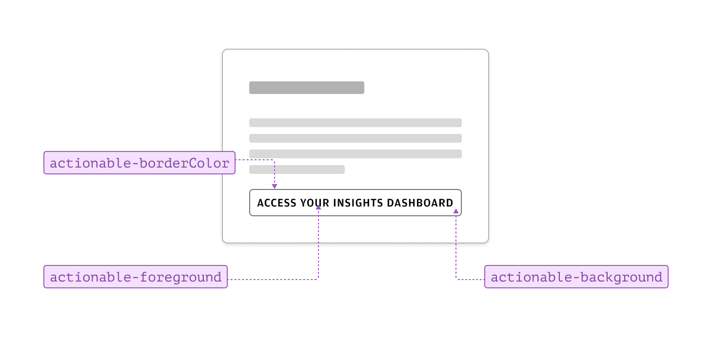
For actionable items, the absence of a sentiment results in a neutral component—a good starting point for understanding actionable tokens in Salt. Buttons use actionable tokens to style borders, foregrounds, and backgrounds. Neutral buttons are ideal for routine or secondary actions that should remain intuitive but not visually dominate the interface.
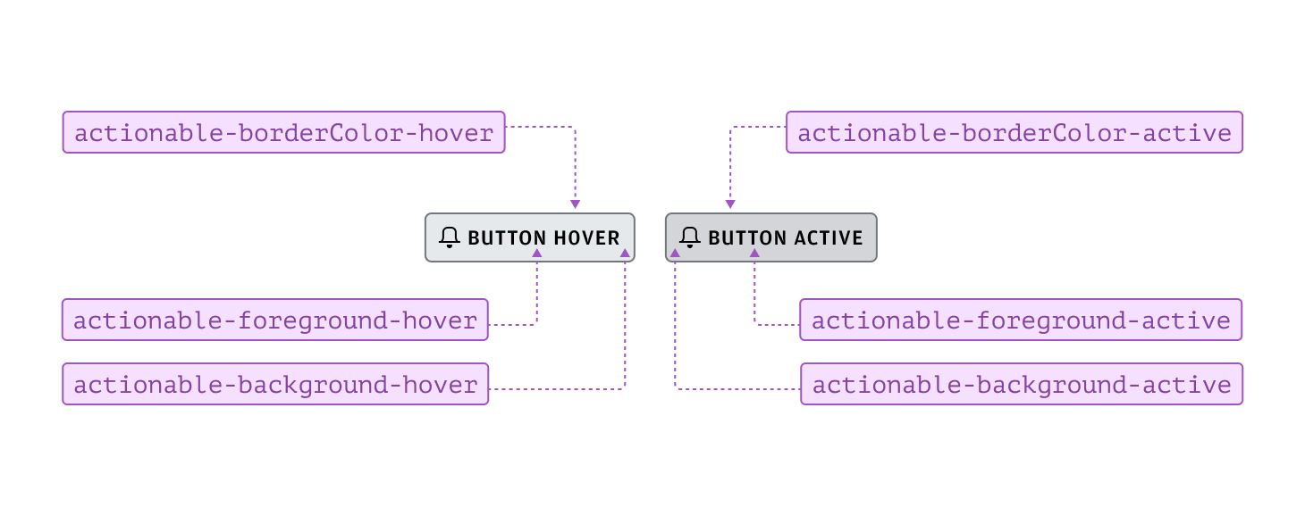
To visually indicate state changes—such as hover and active—in actionable components, use the correct tokens. Salt’s consistent token naming makes it easy to identify which tokens to apply. Each property within a component should reflect the state change, ensuring clear and consistent feedback for users.
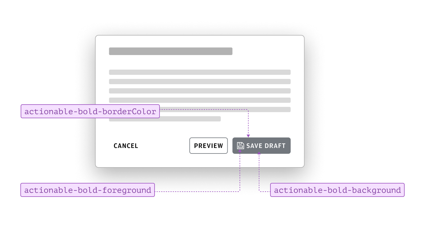
Emphasizing neutral actions can help routine or secondary tasks stand out when needed. By applying bold tokens to neutral actionable components, you increase their visual prominence without introducing other sentiments, making these actions easier for users to identify.
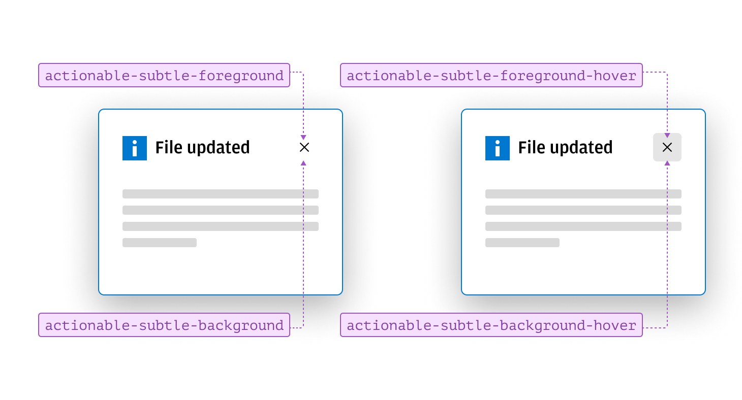
Reducing the prominence of neutral actions is useful for tasks that remain relevant but shouldn’t visually dominate. Applying subtle tokens to actionable components lowers their visual emphasis, allowing more important actions to stand out. For example, a subtle close icon in the top right corner of a dialog stays accessible without drawing attention from the primary action. This approach maintains a clear hierarchy and prevents less critical actions from distracting users.
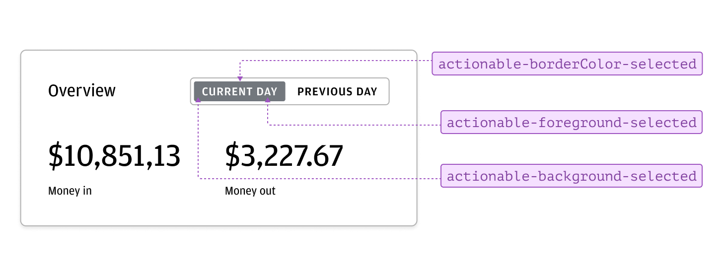
Certain scenarios may require an actionable component to visually communicate a selected state. Toggle Button and Pill are examples of actionable components that allow users to make selections within an interface. To indicate which option is selected, apply the appropriate selected state tokens. This visual change clearly communicates the current selection, helping users identify the active option and supporting intuitive, accessible interactions.
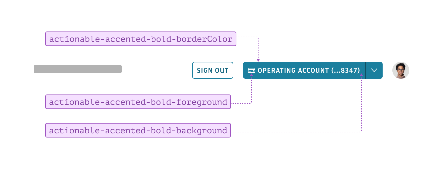
Accented actionable tokens are used to style components that represent core actions within a user interface. These tokens apply the dominant accent color from a theme, making key actions stand out while reinforcing a brand identity. Accented buttons are typically reserved for the most important actions in a workflow, with three appearances available to match the needed level of prominence. Thoughtful use of accent tokens ensures essential actions are visually distinct and easy to identify.
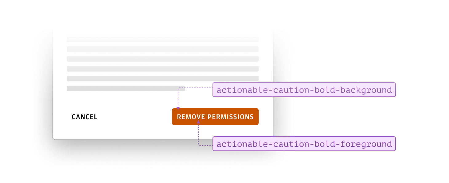
Caution actionable tokens are used to style components that alert users to potential consequences or risks associated with an action. Applying these tokens helps draw attention to actions that may require extra care or consideration, ensuring users are aware of possible outcomes before proceeding.
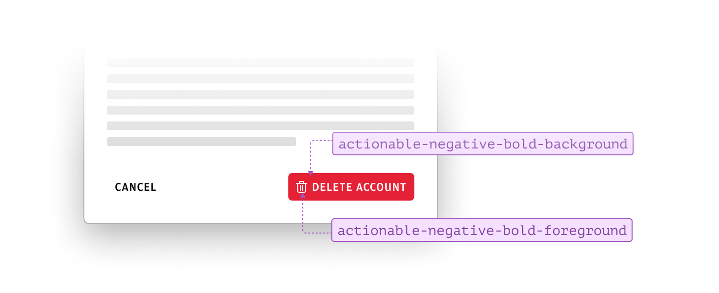
Negative actionable tokens are used to style components that indicate actions with potentially harmful or destructive outcomes, such as deleting data or canceling a process. Applying these tokens helps users recognize actions that may result in loss or irreversible changes, prompting them to proceed with increased caution.
Positive actionable tokens are used to style components that indicate actions with beneficial or constructive outcomes, such as saving changes or confirming a successful process. Applying these tokens helps users easily identify actions that lead to positive results, reinforcing confidence and encouraging engagement.

We appreciate your thoughts and feedback on any content in the Salt foundations. Please contact us if you have any comments or questions.