Container characteristic
Container tokens define the background and structure of interface elements, helping to group related content and create visual hierarchy. Each variant—primary, secondary, and tertiary—aligns with theme background colors to support different levels of emphasis. Containers can also include borders and shadows, with shadow options provided by the Overlayable characteristic, to further distinguish and elevate content within your layout.
Each theme in Salt offers three background colors to help define hierarchy within a layout. These are typically used as the background color for an entire screen as well as any neutral containers within it. While these are suggested uses for the three background colors, they are not strict rules—designers can adapt them as needed to suit their layout and content.
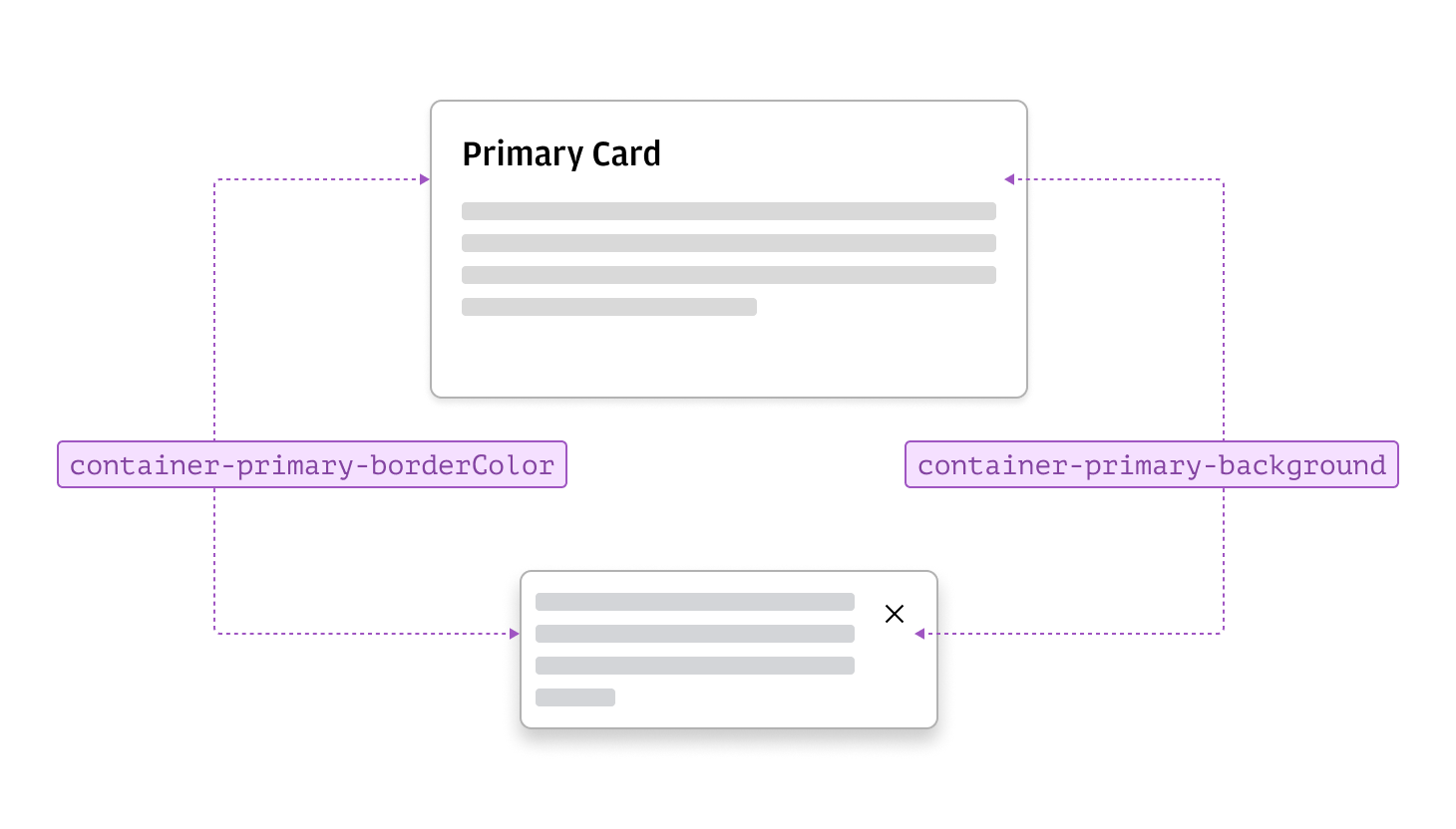
- Primary can serve as the first-level container within a page, forming the standard background for components like cards, panels, drawers, and app headers.
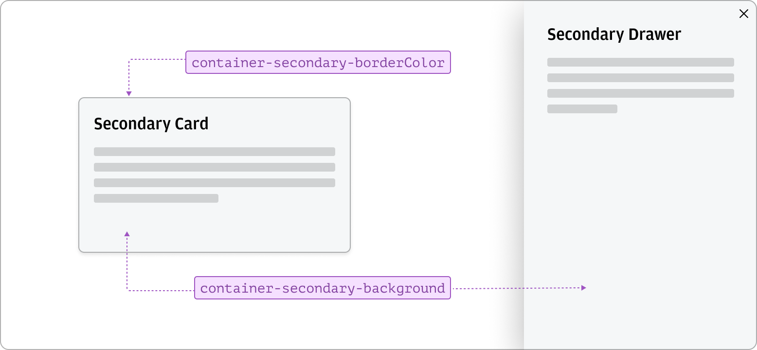
- Secondary can provide the page-level background.
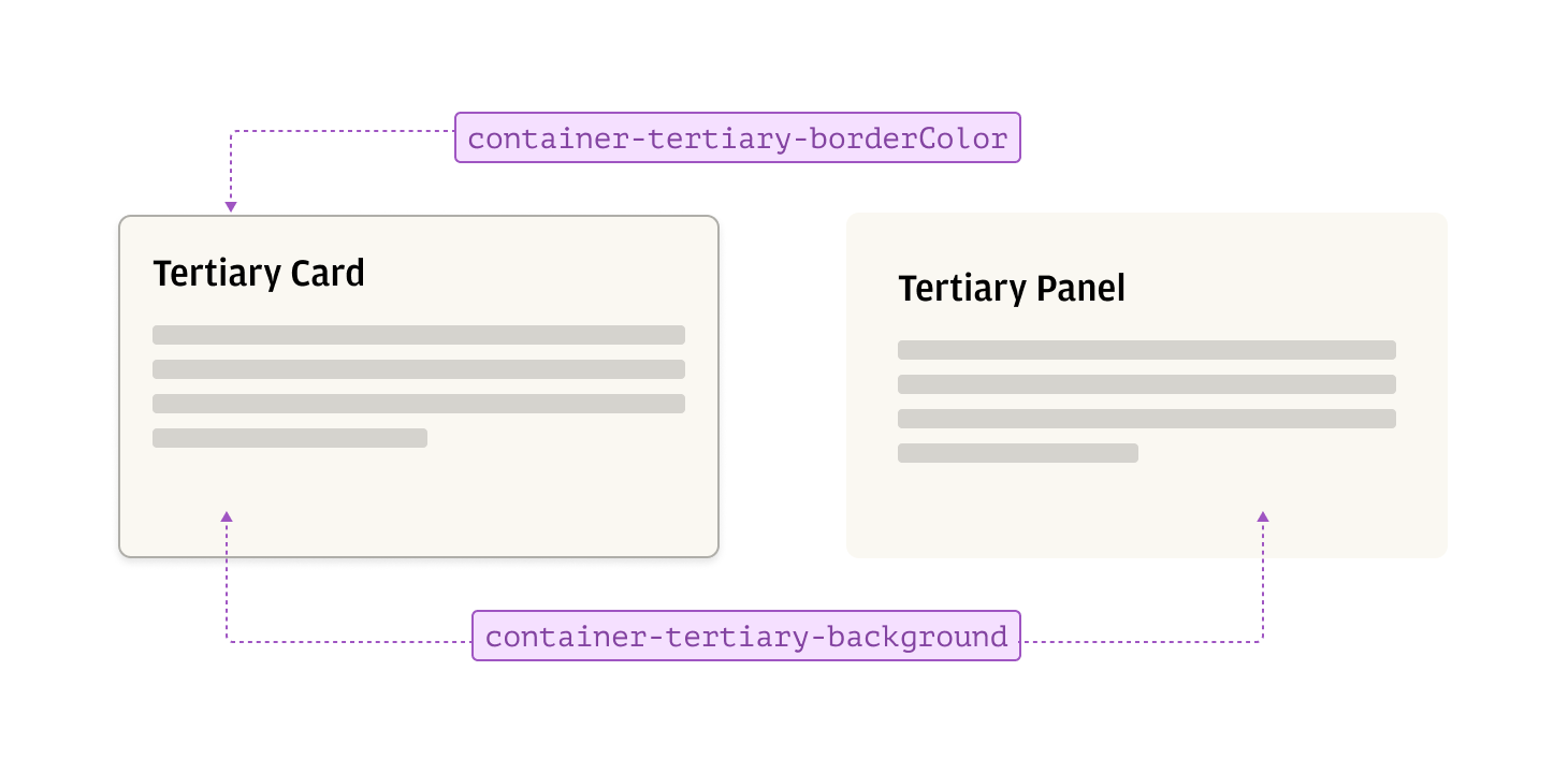
- Tertiary is used less frequently, it can offer an alternate to primary and secondary, mainly to highlight key content areas.
Borders in Salt maintain a consistent style and width, providing thin, solid lines around containers when needed.
| Property | Token |
|---|---|
| borderWidth | --salt-size-fixed-100 |
| borderStyle | --salt-borderStyle-solid |
Each container background has a corresponding border color designed to be used together for a cohesive appearance. Avoid mixing container backgrounds and border colors from different levels, as this may disrupt visual consistency within your layout, depending on the theme you are using.
Primary containers combine background and border tokens to ensure a consistent container style. They serve as the dominant container within a page, providing the standard background for components such as cards, panels, drawers, and dialogs. Optional borders and shadows can be added to enhance visual appeal and adjust the container’s prominence within the visual hierarchy.
Secondary containers combine secondary background and border tokens to provide an alternative container style. They are available as a variant for components such as cards and drawers, offering a different visual treatment within a layout.
Tertiary containers use tertiary background and border tokens to offer an alternative visual style within a layout. They are available as a variant for components such as cards and panels, and are typically used to highlight key content areas or provide subtle differentiation from primary and secondary containers.
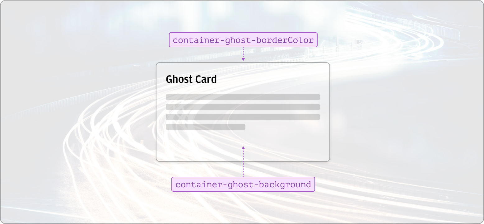
Ghost containers use translucent backgrounds and borders to blend seamlessly with surrounding elements, supporting a fluid and less compartmentalized layout. They are ideal for designs that require a continuous flow of information, such as highlighting specific content over custom backgrounds, images or gradients. Borders can be used optionally to provide subtle distinction when needed.
The target characteristic is used in drag-and-drop interactions to visually indicate when a container or area of the screen is an eligible drop target. It updates the container’s appearance to show when a dragged item—such as a document for attaching or uploading—can be dropped, providing clear feedback and enhancing the user experience.
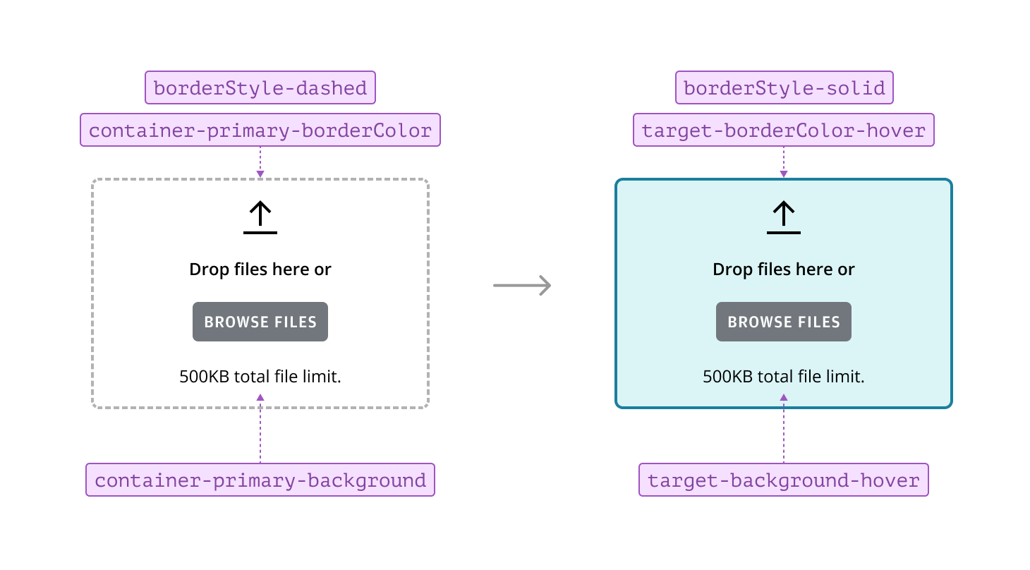
Drag-and-drop targets are one of the few instances where a container’s border style differs from the standard solid style. The --salt-borderStyle-dashed token is used to indicate that a container is a valid drop target.
| Property | State | Token |
|---|---|---|
| borderStyle | Target | --salt-borderStyle-dashed |
| Hover | --salt-borderStyle-solid |
Shadows are frequently used with containers to provide a sense of elevation, adding depth and dimension to the design. Find out more about the Overlayable characteristic and the Shadow foundation.