Navigable characteristic
The Navigable characteristic defines the colors and styles for components that support navigation, such as Tabs, Vertical Navigation or Navigation Item. These components enable users to switch between sections, pages, or data sets and change context easily. The tokens highlighted in this guide ensure navigation elements are visually clear and consistent, making it easy for users to move through different parts of the interface.
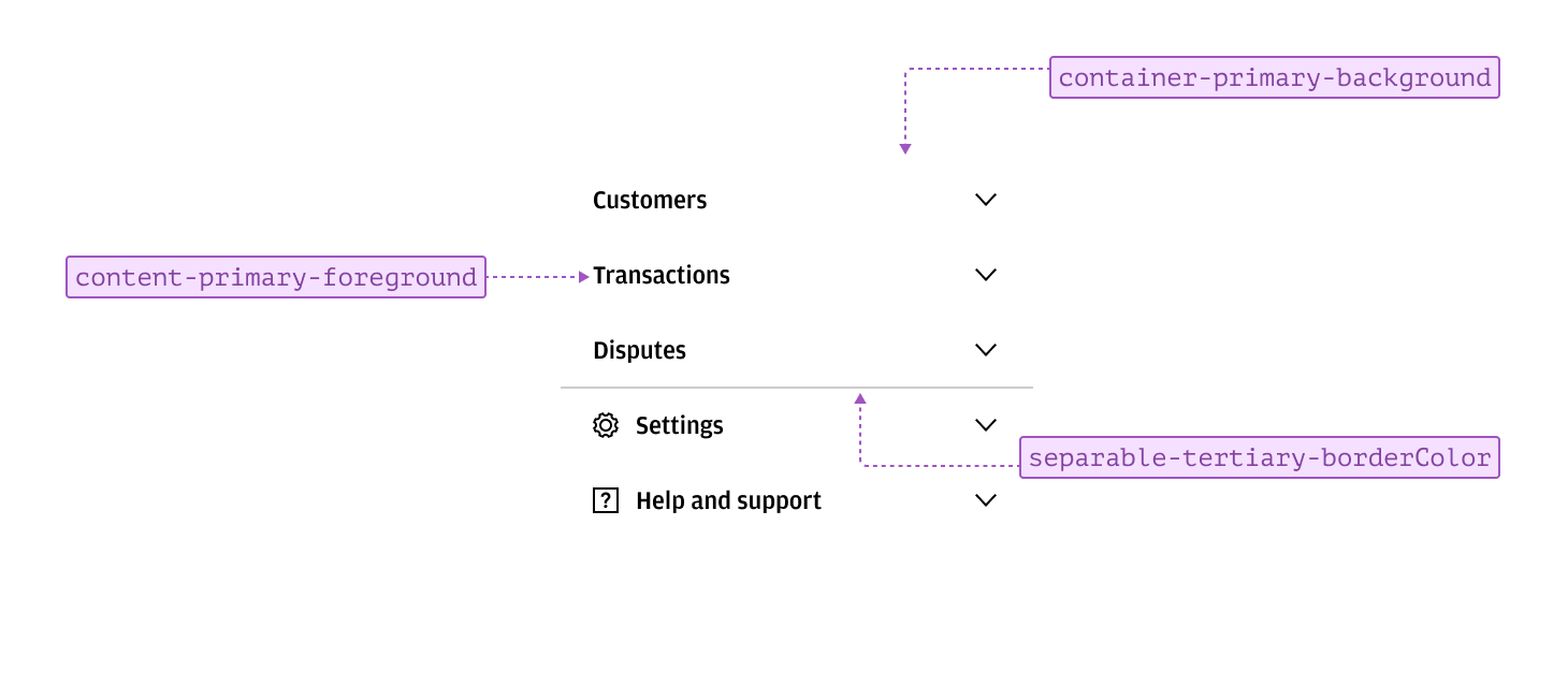
Navigable items typically appear in a list and use standard content and container styling. Clear context and labeling help with sign-posting and recognition, ensuring users can quickly identify and access different sections.
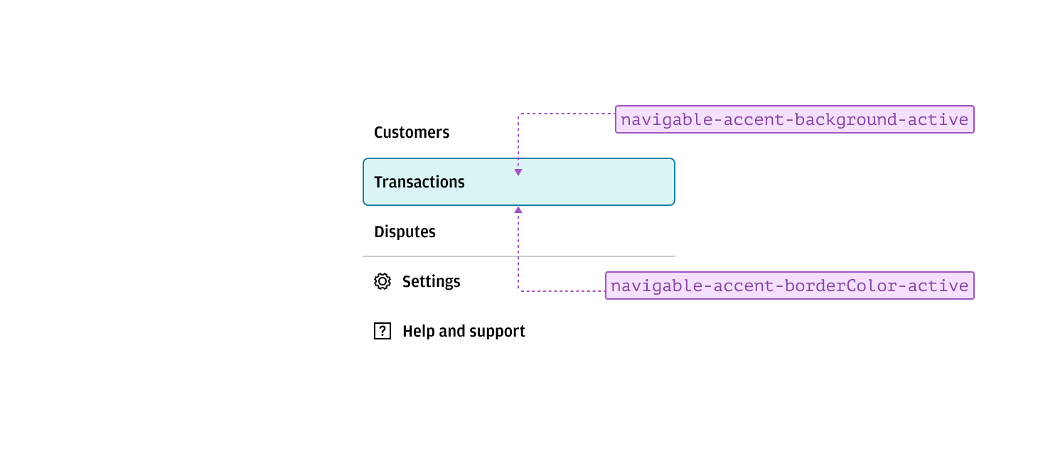
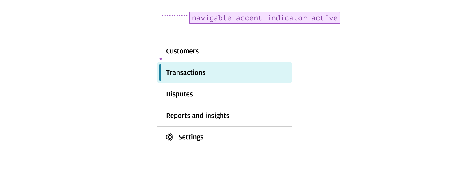
An active tab, page, or section can be indicated using accented border and background tokens. This styling allows the active item to stand out from other navigable options, making it clear which section is currently selected.
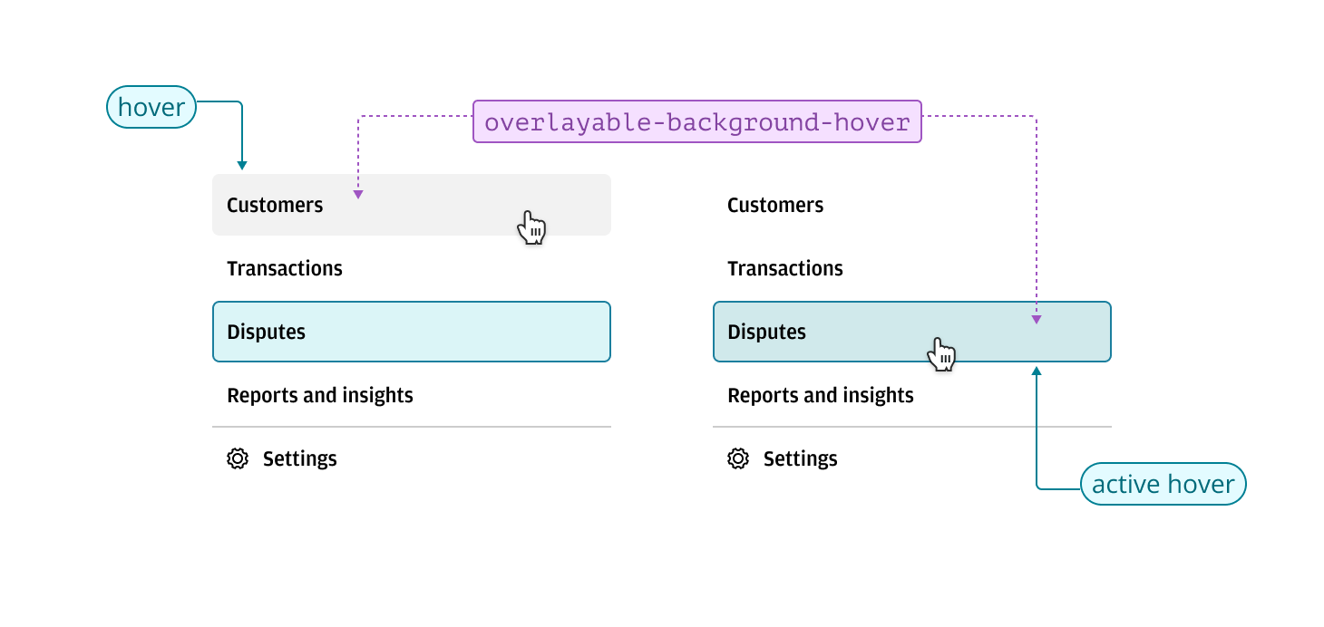
Hover states for navigable items use the overlayable characteristic to provide a subtle transition from the default state. A translucent background is applied to the item being interacted with, allowing the container’s background to remain visible. This approach prevents color clashes and ensures the hover state does not blend in with its parent background, maintaining clarity and visual distinction.
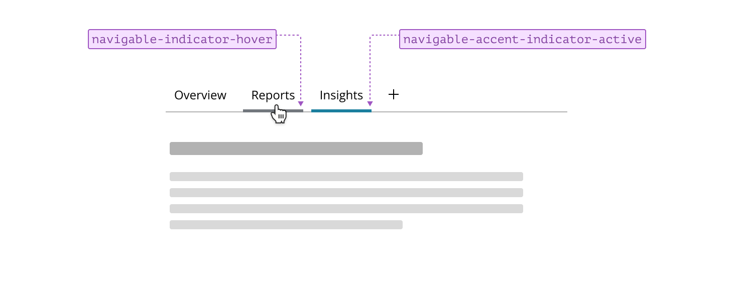
Indicators can be used alongside or instead of background and border changes to highlight navigable items. Applying indicators together with background changes gives active items greater prominence and emphasis, making them stand out—especially useful in primary navigation with many options, where clear differentiation is important.
Alternatively, relying solely on indicators for hover and active states creates a subtler navigation experience, which is typically reserved for in-page navigation components such as tabs. This approach helps maintain a clean interface while still providing clear feedback to users.