Selectable characteristic
Selectable tokens specify the colors and styles for components that support user selection. This characteristic is used for elements like radio buttons, checkboxes, switches, selectable list items, and menus. Selectable ensures these components are visually clear and consistent, making it easy for users to identify and interact with options throughout an interface.
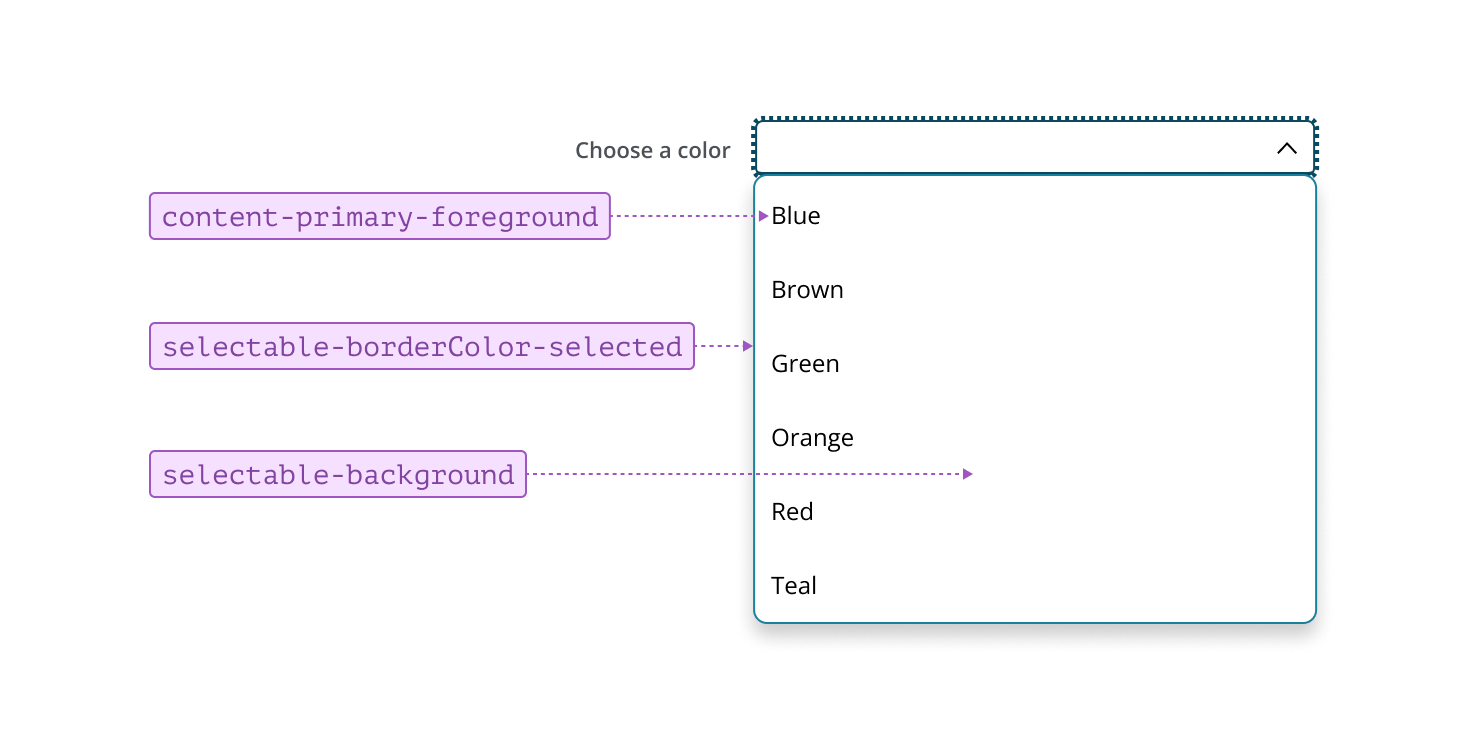
When styling selectable lists, use selectable tokens to define the default, hover, and active states. In the default state, items use standard background and foreground tokens to ensure options are easy to read.
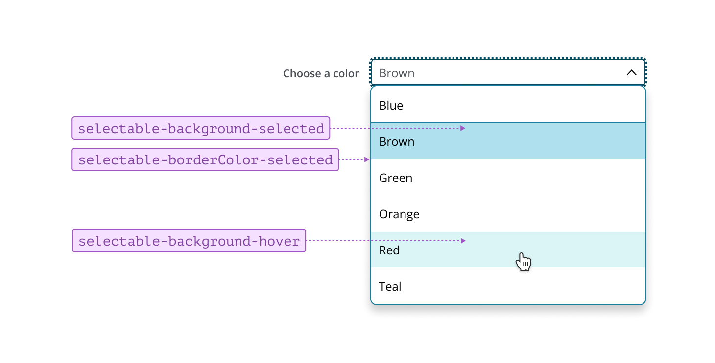
On hover, the background changes to provide subtle visual feedback, signaling interactivity. When an item is selected, the background and borders update to highlight the choice, making it easy for users to identify which option(s) is currently selected. Consistently applying these states helps users interact with lists confidently and efficiently.
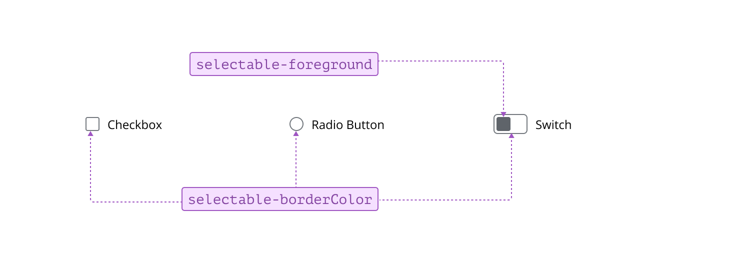
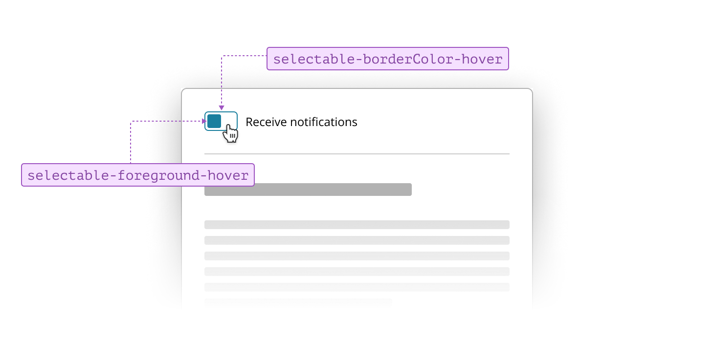
Selectable controls, such as Radio Button, Checkbox, and Switch, use tokens consistently across all states. This approach ensures these components are easy to identify and interact with, providing clear feedback to users as they make selections within the interface.
On hover, selectable controls update their border and foreground tokens to the hover equivalents of the default values, providing clear feedback as users interact with the components.
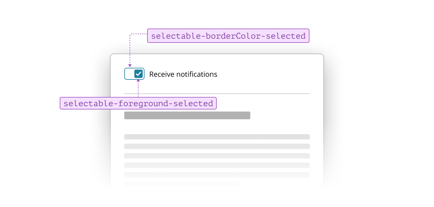
When selected, the border and foreground tokens update to indicate the state change, making the chosen option easy to identify.