Separable characteristic
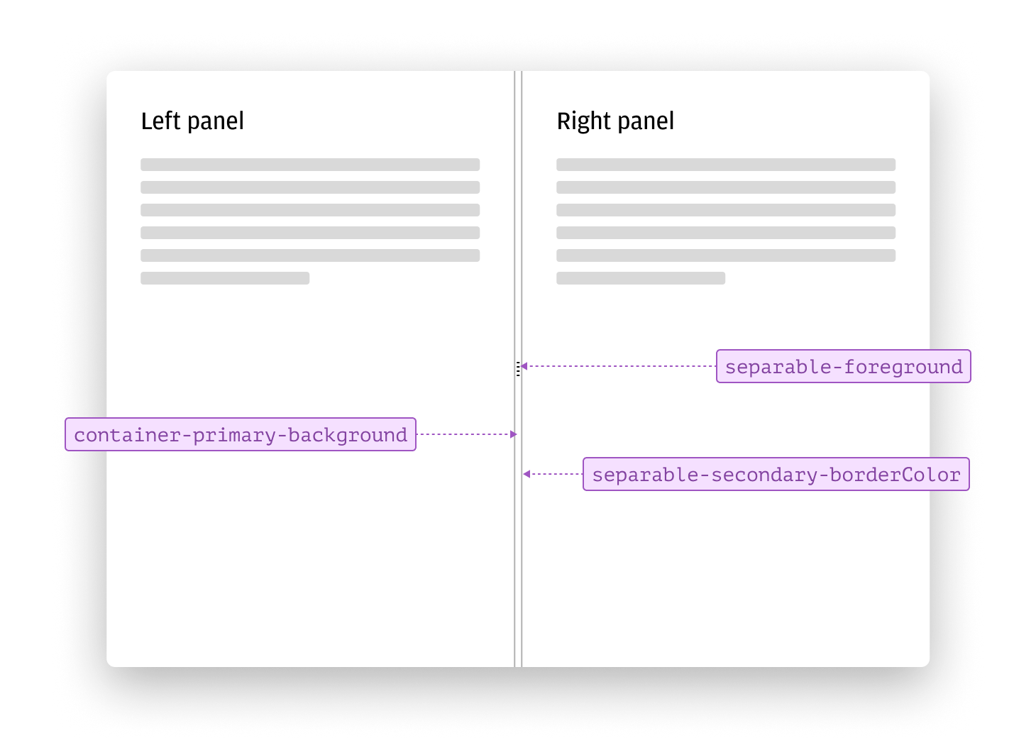
Separable tokens help organize and structure interfaces by visually dividing regions of a screen, sections of content, or groups of related information. Using separable tokens consistently makes complex layouts easier to navigate and helps users focus on what matters most.
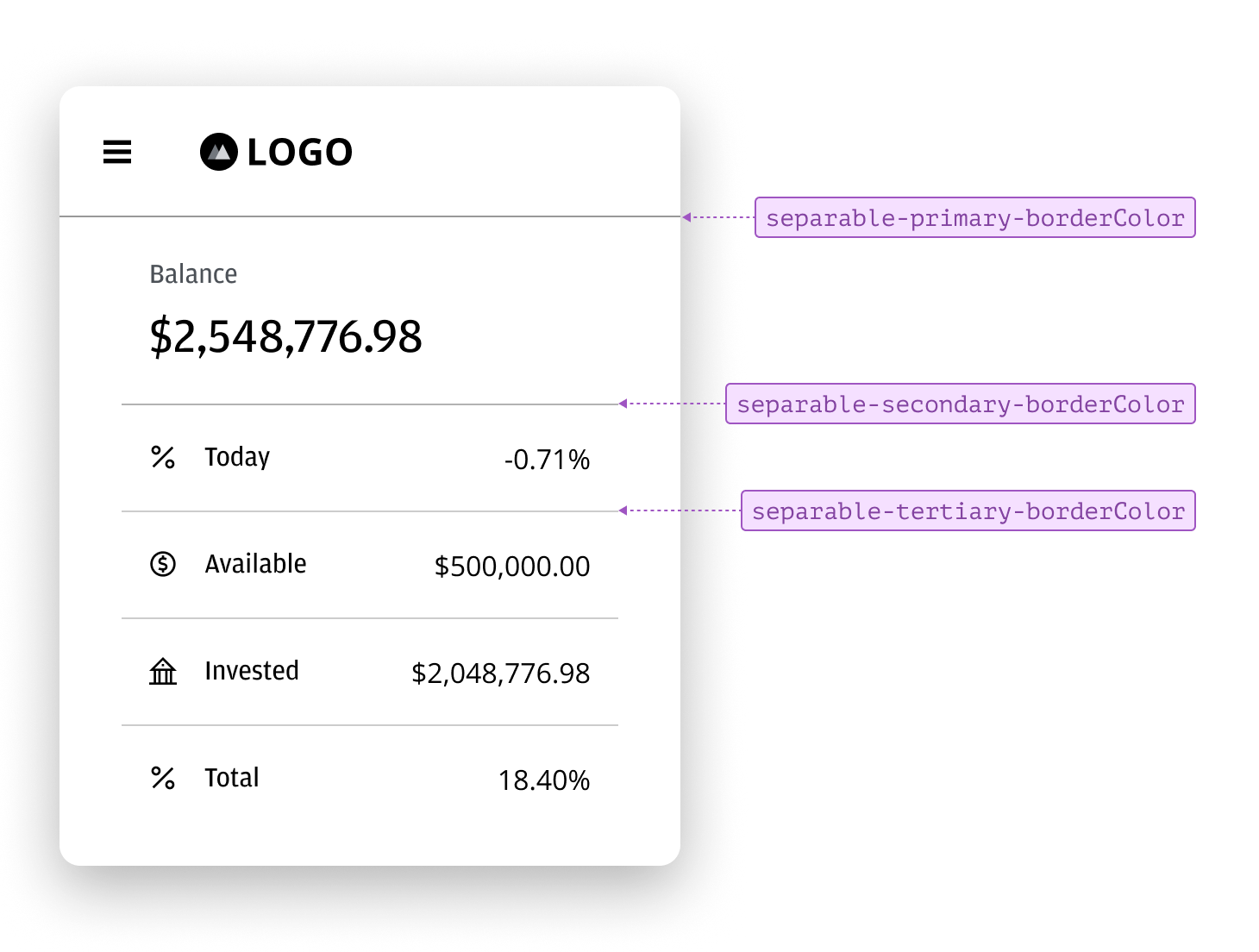
Static separators use primary, secondary, and tertiary variants to provide different levels of emphasis. Primary separators create strong visual divisions; secondary separators offer moderate emphasis; and tertiary separators provide subtle separation. This range allows you to establish clear hierarchies and improve readability across your interface.
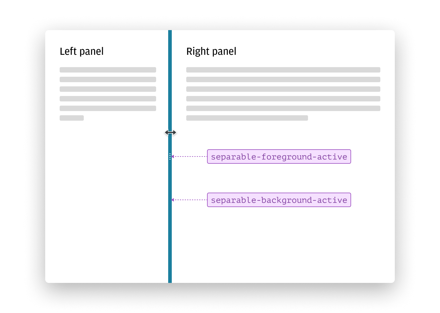
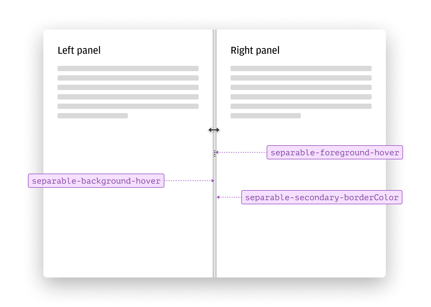
Controllable separators use different tokens to indicate interactive states, such as hover and active. When a user interacts with a separator—like dragging to resize regions—the tokens change to provide clear visual feedback.
On hover, controllable separators update their background and border tokens to provide subtle visual feedback, indicating the separator is interactive.
When active, the tokens change again to highlight the separator, making it clear which element is currently being adjusted.