Status characteristic
Statuses provide visual cues that communicate the current state of a system or process. Each status—error, info, caution, and success—helps users quickly understand what’s happening, identify issues, and determine if action is needed. Consistent use of status tokens ensures users can respond confidently and efficiently to changes or events within your application.
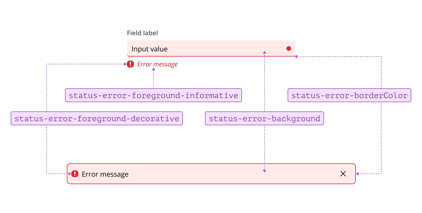
Error tokens are used to indicate a problem or failure that requires user attention or intervention. They represent situations where an action cannot be completed, data is invalid, or a critical issue must be resolved before the user can proceed.
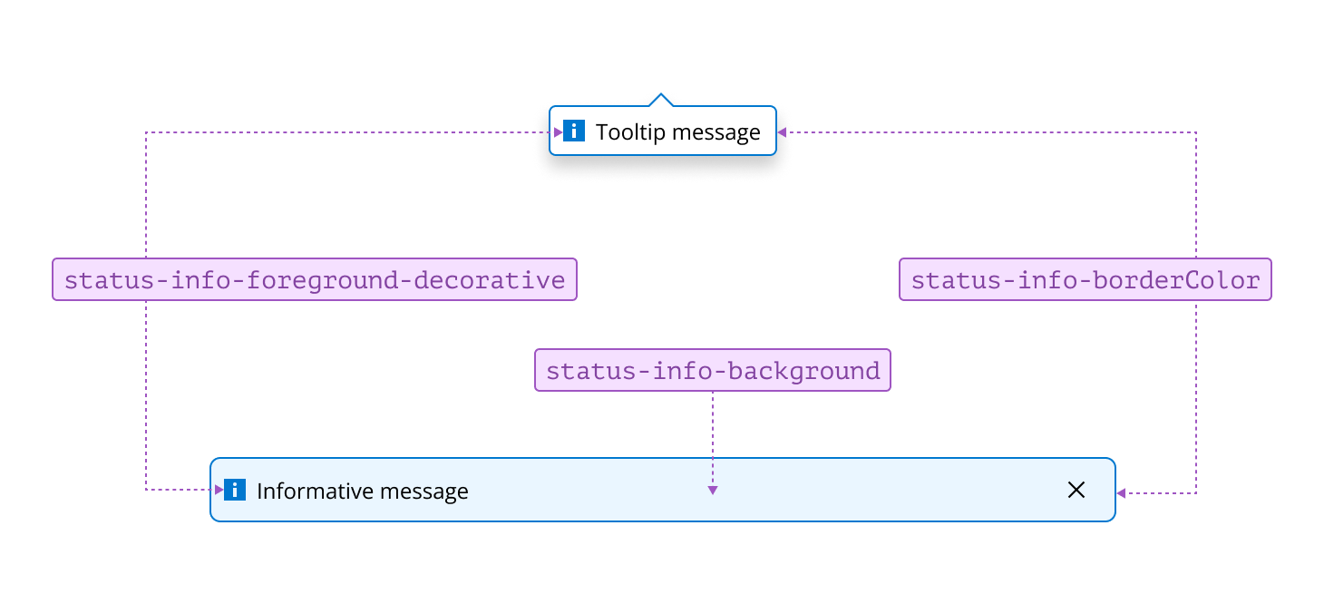
Info tokens are used to communicate helpful or contextual information to users. They represent updates, notifications, or guidance that support user understanding without indicating a problem or requiring action. In components such as tooltips, it’s not always necessary to use both border and background colors to indicate a status—a border color alone can be sufficient if it is accompanied by a descriptive label or icon to ensure accessibility.
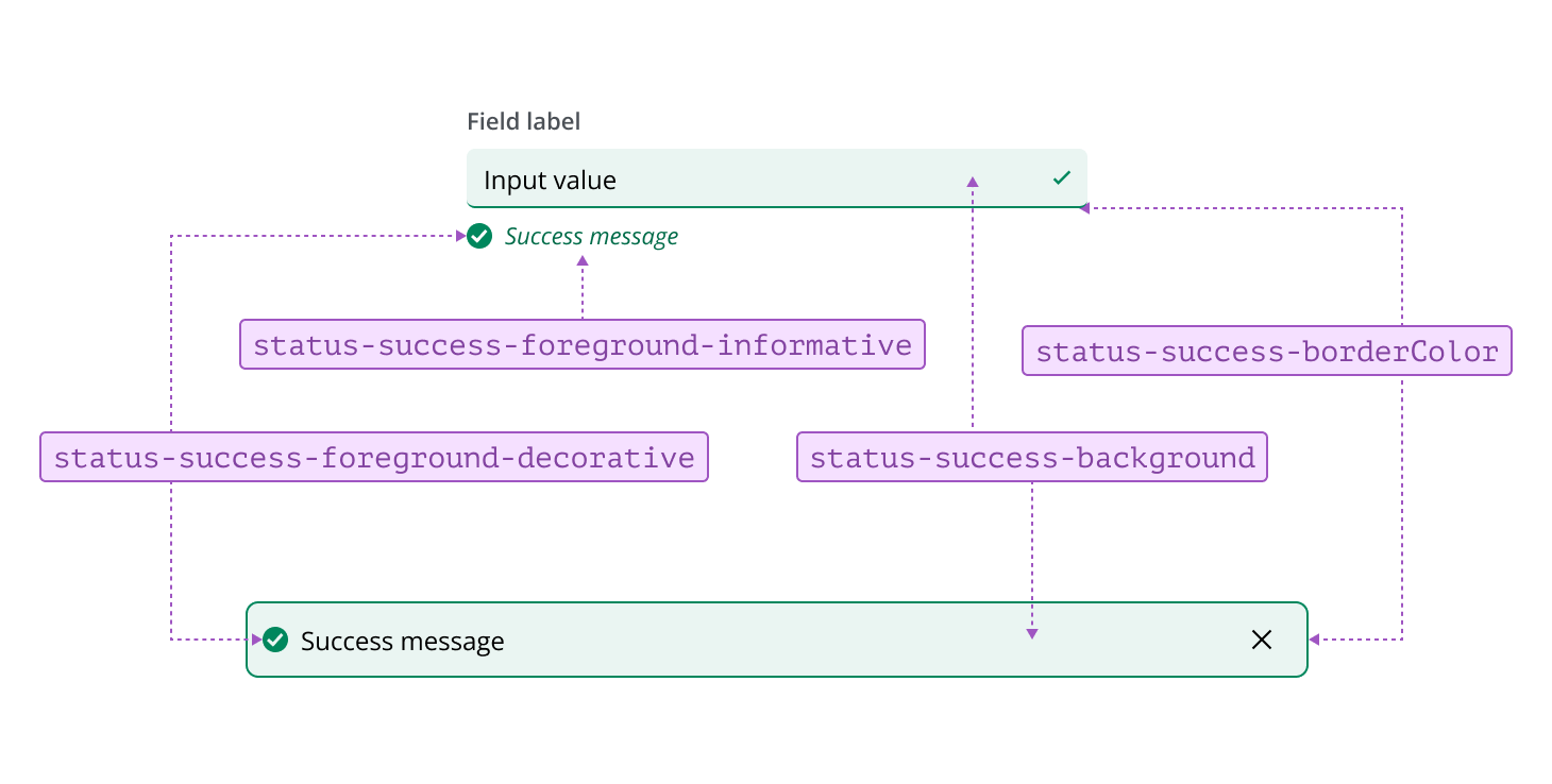
Success tokens are used to indicate that an action has been completed successfully or a process has finished as expected. They represent positive outcomes, confirmations, or achievements within the system.
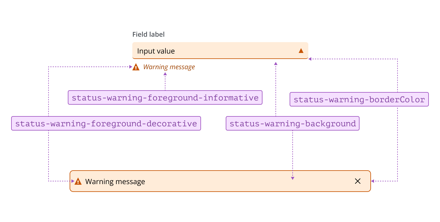
Warning tokens are used to highlight situations that may require caution or could lead to potential issues. They represent conditions where users should be aware of possible risks or take preventive action, but immediate intervention is not always necessary.
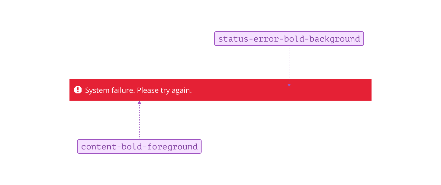
To make a status stand out, you can apply greater emphasis by using bold tokens. This increases visual prominence and helps draw attention to important states such as error, info, warning, or success within your interface, ensuring users can quickly identify and respond to key messages or alerts.